Our timeline to build an in-browser vision mixer for BBC R&D (previously, previously) is extremely tight – just 2 months. UX and development runs concurrently in Agile fashion (a subject for a future blog post), but design was largely done within the first month.
Too frequently for projects on such timescales there is pressure to omit user testing in the interest of expediency. One could say it’s just a prototype, and leave it until the first trials to see how it performs, and hopefully get a chance to work the learnings into a version 2. Or, since we have weekly show & tell sessions with project stakeholders, one could argue complacently that as long as they’re happy with what they’re seeing, the design’s on track.
Why test?
But the stakeholders represent our application’s target users only slightly better than ourselves, which is not very well – they won’t be the ones using it. Furthermore, this project aims to broaden the range of potential operators – from what used to be the domain of highly experienced technicians, to something that could be used by a relative novice within hours. So I wanted to feel confident that even people who aren’t familiar with the project would be able to use it – both experts and novices. I’m not experienced in this field at all, so I was making lots of guesses and assumptions, and I didn’t want to go too far before finding they’re wrong.
One of the best things about working at the BBC is the ingrained culture of user centred design, so there was no surprise at the assumption that I’d be testing paper prototypes by the 2nd week. Our hosts were very helpful in finding participants within days – and with 100s of BBC staff working at MediaCity there is no danger of using people with too much knowledge of the project, or re-using participants. Last but not least, BBC R&D has a fully equipped usability lab – complete with two-way mirror and recording equipment. Overkill for my purposes – I would’ve managed with an ordinary office – but having the separate viewing room helped ensure that I got the entire team observing the sessions without crowding my subject. I’m a great believer in getting everyone on the project team seeing other people interact with and talk about the application.
Paper prototypes
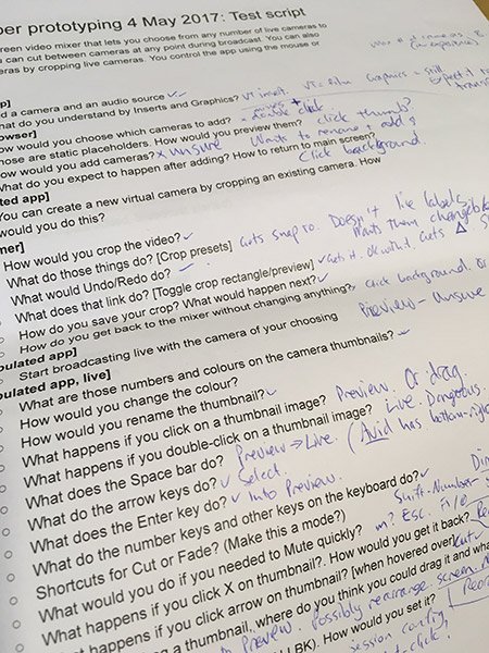
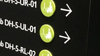
Paper prototypes are A3 printouts of the wireframes, each representing a state of the application. After giving a brief description of what the application is used for, I show the page representing the application’s initial state, and change the pages in response to user actions as if it were the screen. (Users point to what they would click.) At first, I ask task-based questions: “add a camera and an audio source”; “create a copy of Camera 2 that’s a close-up”; etc. As we linger on a screen, I’ll probe more about their understanding of the interface: “How would you change the keyboard shortcut for Camera 1?”; “What do you think Undo/Redo would do on this screen?”; “What would happen if you click that?”; and so on. It doesn’t matter that the wireframes are incomplete – when users try to go to parts of the application that haven’t been designed yet, I ask them to describe what they expect to see and be able to do there.
In all, I did paper prototype testing with 6 people on week 2, and with a further 3 people on week 3. (With qualitative testing even very few participants tend to find the major issues.) In keeping with the agile nature of the project, there was no expectation of me producing a report of findings that everyone would read, although I do type up my notes in a shared document to help fix them in my memory. Rather, my learnings go straight into the design – I’m usually champing at the bit to make the changes that seem so obvious after seeing a person struggle, feeling really happy to have caught them so early on. Fortunately, user testing showed that the broad screen layout worked well – the main changes were to button labels, icon designs, and generally improved affordances.
Interactive prototypes
By week 4 my role had transitioned into front-end development, in which I’m responsible for creating static HTML mockups with the final design and CSS, which the developers use as reference markup for the React components. While this isn’t mainstream practice in our industry, I find it has numerous advantages, especially for an Agile project, as it enables me to leave the static, inexact medium of wireframes behind and refine the design and interaction directly within the browser. (I add some some dynamic interactivity using jQuery, but this is throwaway code for demo purposes only.)
The other advantage of HTML mockups is that they afford us an opportunity to do interactive user testing using a web browser, well before the production application is stable enough to test. Paper prototyping is fine up to a point, but you have plenty of limitations – for example, you can’t scroll, there are no mousever events, you can’t resize the screen, etc.
So by week 5 I was able to test nearly all parts of the application, in the browser, with 11 users. (This included two groups of 4, which worked better than I expected – one person manning the mouse and keyboard, but everyone in the group thinking out loud.) It was really good being able to see the difference that interactivity made, such as hover states, and seeing people actually trying to click or drag things rather than just saying what they’d do gave me an added level of confidence in my findings. Again, immediately afterwards, I made several changes that I’m confident improves the application – removing a redundant button that never got clicked, adding labels to some icons, strengthening a primary action by adding an icon, among others. Not to mention fixing numerous technical bugs that came up during testing. (I use Github comments to ensure developers are aware of any HTML changes to components at this stage.)
Never stop testing
Hopefully we’ll have time for another round of testing with the production application. This should give a more faithful representation of the vision mixing workflow, since in the mockups the application is always in the same state, using dummy content. With every test we can feel more confident – and our stakeholders can feel more confident – that what we’re building will meet its goals, and make users productive rather than frustrated. And on a personal level, I’m just relieved that we won’t be launching with any of the embarrassing gotchas that cropped up and got fixed during testing.
Read part 4 of this project working with BBC R&D where we talk about compositing and mixing video in the browser.
[Update: Now the project is complete you can read the case study on the main website]
